Post by: CattyKid on January 15, 2006, 01:56:00 PM
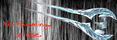
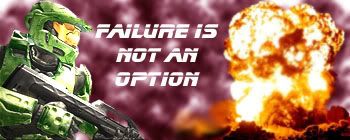
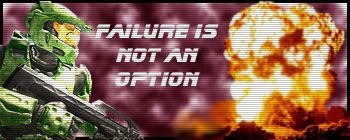
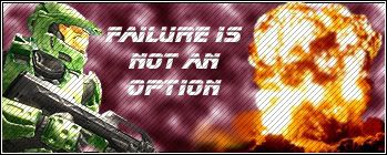
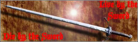
I figured I'd start out with a nice, easy Halo Sig, overdone, I know. So, here they both are.
Tell me which you like better and have VERY open criticism on my work, but don't use many technical terms if you can avoid them (I can always look them up).
I understand that criticism is the only way I'll get better, so let me have it, and don't be shy.
First one:
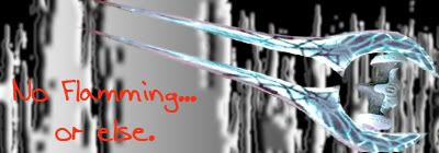
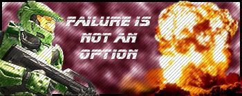
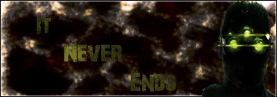
Second one:
EDIT: Do you find the text a little hard to read?
EDIT2: I didn't follow any tutorials on this (Besides how to use the Extract function), it's all just the result of poking around.
Post by: deadparrot on January 15, 2006, 02:00:00 PM
QUOTE(CattyKid @ Jan 15 2006, 09:03 PM) 
EDIT: Do you find the text a little hard to read?
Yes.
Do something more with those fibers. Make them colourful or something. Then fix the text. Gradient overlays or something along those lines.
Post by: Rylinkus on January 15, 2006, 02:05:00 PM
Post by: CattyKid on January 15, 2006, 02:16:00 PM

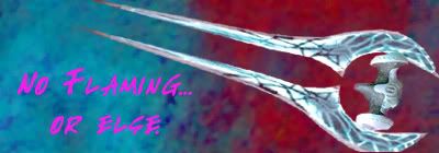
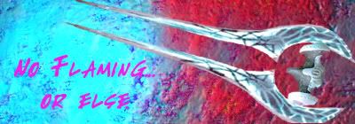
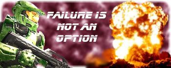
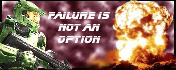
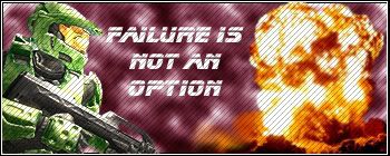
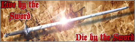
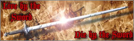
And a version with a softer background (I think it makes the foreground stand out more):
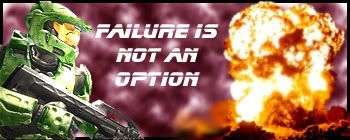
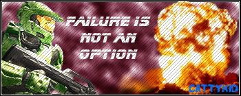
Finally, the second one with some lighting effects I played around with:
I appreciate the criticism, keep it coming.
Post by: soupy_31 on January 15, 2006, 03:49:00 PM
QUOTE(CattyKid @ Jan 15 2006, 04:23 PM)
Okay, thanks for the input, I'll see what I can do.
And a version with a softer background (I think it makes the foreground stand out more):
Finally, the second one with some lighting effects I played around with:
I appreciate the criticism, keep it coming.
Find some new renders,
Find some brushes,
Find some new fonts,
and finally, think about your colour scheme before you start.
Post by: CattyKid on January 15, 2006, 04:55:00 PM
QUOTE(soupy_31 @ Jan 15 2006, 05:56 PM)
Find some new renders,
Find some brushes,
Find some new fonts,
and finally, think about your colour scheme before you start.
Sorry, but what are renders (is that the picture, like the energy sword)? What do brushes allow me to do?
Can you suggest any fonts that look good with sigs? I've got a couple thousand.
I think I'll do a totally different sig with a totally different image.
EDIT: And thanks for your continued help.
Post by: soupy_31 on January 15, 2006, 05:07:00 PM
QUOTE(CattyKid @ Jan 15 2006, 07:02 PM)
Sorry, but what are renders (is that the picture, like the energy sword)? What do brushes allow me to do?
Can you suggest any fonts that look good with sigs? I've got a couple thousand.
I think I'll do a totally different sig with a totally different image.
EDIT: And thanks for your continued help.
Renders are the image you use for your sig. In your sig, yes, the render is the energy sword.
Brush's allow you have different backround effects for the different theme of the sig..
www.dafont.com had about every type of font you could dream of, check there.
And I would love to see some more of your work!
Keep it up.

Post by: speed_racer88 on January 15, 2006, 05:42:00 PM
QUOTE(soupy_31 @ Jan 15 2006, 03:56 PM)
Find some new renders,
Find some brushes,
Find some new fonts,
and finally, think about your colour scheme before you start.
that's pretty harsh coming from a guy who 2 months ago was in the same place. cattykid, i recommend that you look at this tutorial, it is a great place to start. also the term "render" pretty much means picture.
Post by: soupy_31 on January 15, 2006, 05:49:00 PM
QUOTE(speed_racer88 @ Jan 15 2006, 07:49 PM)
that's pretty harsh coming from a guy who 2 months ago was in the same place. cattykid, i recommend that you look at this tutorial, it is a great place to start. also the term "render" pretty much means picture.
Huh? I wan't trying to be harsh in any way.. If I sounded that way I'm sorry.
Just giving some advice...
Post by: w2kj on January 15, 2006, 06:41:00 PM
 It's cool; CK....everybody has to start somewhere. I don't think that anybody was trying to be cruel. I know that a few months ago these folks took the time to give me some constructive criticism....it gave me the chance to find some direction. I have a long way to go...but half the fun (and the frustration) is the way to learn.
--w2kj
Post by: CattyKid on January 15, 2006, 07:46:00 PM
So, I'm checking out the links everyone sent me right now. I should have a new sig up in a few hours (at least I WANT to).
Also, thanks for the encouragement. I got into Photoshop this week at school (newspaper editor, we have 7.0?). I used it to fix some girls's screwed up hair and TERRIBLE shadow in a picture. Since then, I've been hooked.
EDIT: Soupy's only been doing this stuff for 2 months? I thought Photoshop took a YEAR to get good at. Guess I was wrong.
Post by: soupy_31 on January 15, 2006, 07:55:00 PM
QUOTE(CattyKid @ Jan 15 2006, 09:53 PM)
EDIT: Soupy's only been doing this stuff for 2 months? I thought Photoshop took a YEAR to get good at. Guess I was wrong.
Yah.
It is always tough at the beginning, but once you gwt the hang of it you almost immediately take off.
BTW, Do you have MSN? I need to ask you something.
Post by: Modderxtrordanare on January 15, 2006, 10:28:00 PM
I like the energy sword render, just not the background. I have a link full of grunged out backgrounds that look cool as hell. But I dont remember if I bought it or iffn it was free.
Post by: CattyKid on January 15, 2006, 10:30:00 PM
I want to send a special thanks to Soupy, who spent at least an hour with me on MSN tonight.
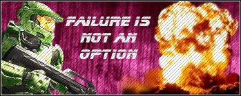
And here, without further adue, is my last sig for the night. The background could use A LOT of work, but it was my first attempt using brushes (thanks again, Soupy). I got a master chief render (he seems a little sad and to e shielding his eyes) and an explosion. I blurred the explosion a little to try and blend make it look a little more natural. I put a light effect on the side of the masterchief facing the explosion. I looked through some text, andI though this one fit well in white (it stood out and was easy to read).
Here it is, my second sig:
Once again, open criticism please. You WON'T hurt my feelings, I promise!
EDIT: This may get scanlines tomorrow, IDK.
Post by: Modderxtrordanare on January 15, 2006, 10:48:00 PM
It should make it drastically better in my opinion.
Post by: CattyKid on January 15, 2006, 11:02:00 PM
QUOTE(Modderxtrordanare @ Jan 16 2006, 12:55 AM)
One word, Border.
It should make it drastically better in my opinion.
You shall ask, and you shall receive.
Two options, the white border or the black:
And the other:
BTW: I agree with you. Who knew a few pixels would make such a difference?
I like the black border the best.
EDIT: Do you mind telling me how you got the white AND Black border? I like it.
Post by: Visualizer on January 15, 2006, 11:14:00 PM
The tutorials there help ALOT. They helped me get started in photoshop about 5 or 6 months ago. I suggest reading the "Basic Help and Navigation" tuts first. Learning the basics first is invaluable later on when you need just that extra something to help make your artwork look better. Keep up the good work man.
Post by: CattyKid on January 15, 2006, 11:16:00 PM
QUOTE(Visualizer @ Jan 16 2006, 01:21 AM)
http://www.pixel2lif..._Photoshop/All/
The tutorials there help ALOT. They helped me get started in photoshop about 5 or 6 months ago. I suggest reading the "Basic Help and Navigation" tuts first. Learning the basics first is invaluable later on when you need just that extra something to help make your artwork look better. Keep up the good work man.
Thanks. I'll take a look tomorrow.
Now, my LAST update for tonight. Here is my sig, WITH SCANLINES! Hooray!
I think it looks fantastic with the scanlines!
Post by: Modderxtrordanare on January 15, 2006, 11:21:00 PM
Confusing, pictures might help but I'm lazy and theres probably a easier way to make a border but this is super fast but hard to explain
Also, with those scan lines, I'd make them diagonal instead of horizontal, and lower the opacity on them some more.
Post by: CattyKid on January 15, 2006, 11:27:00 PM
Goodnight, and thanks for all the help.
Post by: Modderxtrordanare on January 16, 2006, 12:07:00 AM
Its huge so I didnt post a direct image here, its 1024x4500 pixels.
Post by: CattyKid on January 16, 2006, 08:29:00 AM
QUOTE(Modderxtrordanare @ Jan 16 2006, 02:14 AM)
I made you a tutorial on how to make scanlines just now. So tomorow or whenever you get back, check it out.
Its huge so I didnt post a direct image here, its 1024x4500 pixels.
Thanks, that was fool-proof. It was really easy, and it looks pretty good. I'm not sure if I like the diagonal or horizontal scanlines better, though, I have to think.
With your border, I don't know what the horizontal and vertical marquee tools are, sorry.
Here is my picture with the diagonal scanlines:
I think Soupy's going to be proud of his pupil!
Post by: CattyKid on January 16, 2006, 12:54:00 PM
Here it is (couldn't have been done without your help):
The border looks uncomparably better, thanks.
The fact that it's a .jpg makes my renders look smoother than they really are (I think) and does the same for the scanlines.
Any more suggestions, I think I'll make this my new sig!!!
EDIT: I still LOVE the lighting effect on the Master Chief's armor. Photoshop is awesome!

EDIT2:
I figured I need my name in there somewhere, so I stuck it in the bottom right hand corner. I like the font and size, but I'm not sure about the color.
Post by: Modderxtrordanare on January 16, 2006, 01:08:00 PM
EDIT: Just went and fixed that background for you.

Post by: XLostSpartanX on January 16, 2006, 02:19:00 PM
Post by: soupy_31 on January 16, 2006, 04:05:00 PM
You did alot of great stuff from last night till now, but you still need to start spicing up your text.
Great stuff CattyKid! If we see more stuff like this you will be winning SOTW's in no time.

Post by: CattyKid on January 16, 2006, 04:12:00 PM
QUOTE(soupy_31 @ Jan 16 2006, 06:12 PM)
Damn dude, when did you finally go to sleep? lol
You did alot of great stuff from last night till now, but you still need to start spicing up your text.
Great stuff CattyKid! If we see more stuff like this you will be winning SOTW's in no time.
Thanks. I know MooderX fixed it for me, but I went and fixed the border myself.
Here we go, the final copy (I couldn't get my name to fit in this one):
Thanks for EVERYONE who helped. You ALL really helped.
Post by: CattyKid on January 16, 2006, 05:36:00 PM
Post by: Modderxtrordanare on January 16, 2006, 05:39:00 PM
Damn, speaking of homework... I have tons of trig and history due tomorow. Im out.
Post by: CattyKid on January 16, 2006, 08:58:00 PM
QUOTE(Modderxtrordanare @ Jan 16 2006, 07:46 PM)
If you dont like being restricted to the few and overly used renders, you should try making your own and youll be able to have whatever image you want instead of a small selection.
Damn, speaking of homework... I have tons of trig and history due tomorow. Im out.
Like with the extract tool from just in game pictures and such? Is that what you mean? If it is, that's what I've been doing (at least with the Master Chief and the Energy Sword). Or do you mean another way?
(I use Google Image Search, then save the image and extract the part that I want.)
EDIT: No update tonight. Just spent over 1 hour trying to burn an MPEG video, which plays fine, to a DVD. No gots. AV is WAY off, even using Roxio DVD Builder. No dice at all. I've got about 10 programs (all legal) installed on my computer for the purpose, and none worked. I'm just bringing my video in on a flash drive to play on my teacher's computer, which he can hook up to the TV (I call it a Ghetto X2VGA). I'm really going to try to have a nice update for tomorrow.
Post by: Hazanko on January 16, 2006, 09:34:00 PM
it'll show you a few nice tricks, while it will also teach you what a few of the nicer functions in photoshop actually DOThis is the Tut
Post by: CattyKid on January 17, 2006, 02:27:00 PM
I hope you like it, now to mess around a little more and see what I can do!
EDIT: Hazanko, good tut. I knew most of the things, but learned a few.
Can you tell me what font you used for this (I was looking through your photobucket)?:
EDIT 78: One more thing, what kind of filter do people like Himura use in their sig (or even the one above this line)? It produces lots of small dots. Anyone know?
Post by: Hazanko on January 17, 2006, 03:16:00 PM
(1.)create a new document 4x4 pixels, make sure it is transparent
(2.)choose the pencil tool(hold your mouse button down on the brush tool)and choose the 1px brush
(3.) make a 2x2 BLACK box in the upper left hand corner of the document(you may have to zoom in)
(4.)then all you have to do is, just press CTRL+A, and choose edit->define pattern.
(5.)after that, just use it like you would any other pattern, just choose the pattern fill tool(normal paintbucket, just change the word "color" to "pattern")
(6.)create a new layer within your project(CTRL+SHIFT+N), then fill it with your new pattern!!!
hopefully that helps you out

also, just a tip: try this:(don't read on, if you have a version under 7.0) choose a normal default brush that came with your ps, and if you look at the top right, it will have a little tab that says "brush" or something like that, try playing around with those settings, and you can get REALLY cool effects, from default brushes! you can do this trick to any brush you have downloaded also, you can stuff like angle jitter, and stuff like that.
Post by: CattyKid on January 18, 2006, 03:38:00 PM
QUOTE(Hazanko @ Jan 17 2006, 05:23 PM)
well, the font i used is called "depressionist three", or something like that. and as for the dots:
(1.)create a new document 4x4 pixels, make sure it is transparent
(2.)choose the pencil tool(hold your mouse button down on the brush tool)and choose the 1px brush
(3.) make a 2x2 BLACK box in the upper left hand corner of the document(you may have to zoom in)
(4.)then all you have to do is, just press CTRL+A, and choose edit->define pattern.
(5.)after that, just use it like you would any other pattern, just choose the pattern fill tool(normal paintbucket, just change the word "color" to "pattern")
(6.)create a new layer within your project(CTRL+SHIFT+N), then fill it with your new pattern!!!
hopefully that helps you out
also, just a tip: try this:(don't read on, if you have a version under 7.0) choose a normal default brush that came with your ps, and if you look at the top right, it will have a little tab that says "brush" or something like that, try playing around with those settings, and you can get REALLY cool effects, from default brushes! you can do this trick to any brush you have downloaded also, you can stuff like angle jitter, and stuff like that.
Thanks, I a gave both of those a try. I thought the dots were a little big, though, so I made one pixel boxes on a 3*3 square.
And, yeah, you can get cool effects doing that.
Any thoughts on the new sig?
Post by: soupy_31 on January 18, 2006, 04:13:00 PM
QUOTE(CattyKid @ Jan 17 2006, 04:34 PM)
I made thattttt

Post by: CattyKid on January 20, 2006, 10:10:00 PM
He liked it, and lucky me, it's in his sig!!
Now, here is one I just made for fun. It has the Xbox and Xbox 360 Text. It's based on the Evolution of the Xbox. All 19 layers.
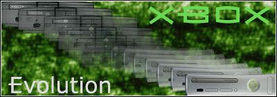
My backgrounds need a little spicing up, but I'd say I'm doing well. Any ideas on the backgrounds, guys?
EDIT: I LOVE scanlines. I guess it shows, though. It seems like they make almost any sig look better.
Post by: h34d5h0tz on January 20, 2006, 11:08:00 PM
Post by: CattyKid on January 20, 2006, 11:37:00 PM
QUOTE(h34d5h0tz @ Jan 21 2006, 01:15 AM)
most of the time, the scanlines should go under the text layer, the render layer, and the border layer. the text on the xbox one is boreing. even a simple 1 px black outline will spice up your text. i would also move the render off the edge of the sig.
Okay. I changed the scanlines to what you said, and I moved the renders off a little. I'm not sure how to easily add a border to text, though. I agree that it is a little boring, and wouldn't mind adding a border, I just want to keep the text as it is the XBOX text and Xbox360 text.
So, how would I go about adding a border to text?

Post by: h34d5h0tz on January 21, 2006, 06:38:00 PM
i was saying to move the xbox and the xbox360 of the edge.
Post by: CattyKid on January 21, 2006, 09:23:00 PM
QUOTE(h34d5h0tz @ Jan 21 2006, 08:45 PM)
i was saying to move the xbox and the xbox360 of the edge.
So THIS is what you meant. I though you said to move some of it off of the sig so that you could not see the entire thing.
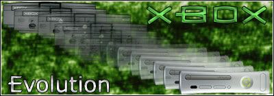
I tossed in the border around the Xbox AND Revolution Text, plus added, in the Bledning Options, Bevel and Emboss and Satin effects.
Better? I'd say it looks better.
Post by: speed_racer88 on January 22, 2006, 01:15:00 AM
Post by: CattyKid on January 22, 2006, 11:51:00 AM
QUOTE(speed_racer88 @ Jan 22 2006, 03:22 AM)
instead of using filters for your backrounds try brushing them with grunge brushes. you can download grunge brushes here, they are a great way to start.
I was using brushes before, hust the same one for the entire background and REALLY overdoign it. I got a brush pack from that site and liked it, I'll get some more.
Here is a revision of my sig, using one of those brush packs:
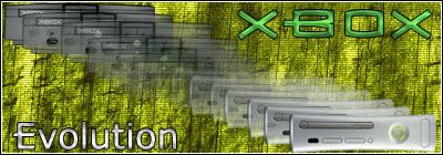
I might redo the background on my current (Halo) sig with one of these brushes, too.
Post by: CattyKid on January 22, 2006, 02:07:00 PM
QUOTE(speed_racer88 @ Jan 22 2006, 03:22 AM)
instead of using filters for your backrounds try brushing them with grunge brushes. you can download grunge brushes here, they are a great way to start.
And here is my original sig with a combination of the grunge brushes:
Do you think that both of them are better than they were before?
Post by: Modderxtrordanare on January 22, 2006, 09:12:00 PM
Its tons better.

Good job my friend.
Post by: CattyKid on January 22, 2006, 09:52:00 PM
QUOTE(Modderxtrordanare @ Jan 22 2006, 11:19 PM)
I like that one, your getting way better as I can compare that one to your original.
Its tons better.
Good job my friend.
Thanks, I appreciate it.
I just want to thank everyone for the help, the tutorials, but most of all, the encouragement and kind words.
I should be enterring into the next SOTW, at least I hope to.
Post by: Modderxtrordanare on January 22, 2006, 11:04:00 PM
Am I allowed to enter?
Post by: Hazanko on January 22, 2006, 11:50:00 PM
Post by: soupy_31 on January 23, 2006, 07:26:00 AM
QUOTE(Hazanko @ Jan 23 2006, 01:57 AM)
yeah, can we enter if we are running the SOTW?
Uhm.. yah.
Post by: CattyKid on January 24, 2006, 09:18:00 PM
The background is still a little plain, though. I need to improve on those.
EDIT: I subtly threw my name in the upper left hand corner, I didn't want it to stand out too much.
Post by: Modderxtrordanare on January 24, 2006, 10:37:00 PM
And that font just doesnt seem to fit nor does that red seem all that suitable.
But I do like the lens flare effect
Your improving drastically
Post by: h34d5h0tz on January 24, 2006, 11:10:00 PM
Post by: CattyKid on January 25, 2006, 07:18:00 PM
Post by: CattyKid on January 25, 2006, 08:18:00 PM
h34d5h0tz, I changed the lens flare, and it does look better + flipped the sword render. I did a 2 px gradient for the reasons mentioned above, and moved the text so it's more readable.
In addition, after redoing the background, I upped the brightness a little and decreased the contrast, which I thought helped make it look more as if the light was brightening the picture.
Any thoughts on the new version?
Once again, I want to thank you all for your kind words, but especially your criticisms. I definately think I'm much better, and I'm most importantly having a good time.
Post by: CattyKid on January 27, 2006, 10:14:00 PM
Post by: Modderxtrordanare on January 27, 2006, 10:22:00 PM
Get rid of that horrible 2px gradient stroke around the words.
Post by: CattyKid on January 27, 2006, 11:09:00 PM
QUOTE(Modderxtrordanare @ Jan 28 2006, 12:29 AM)
Move the font in a little so its not off the edge.
Get rid of that horrible 2px gradient stroke around the words.
Done. The text then looked plain, so I added a 1 px border around it and a drop shadow.
In this pick, I did a little beveling and liked the outcome.

Which of the two do you guys like better, and why?
Post by: Modderxtrordanare on January 28, 2006, 10:10:00 AM
Post by: CattyKid on January 28, 2006, 03:25:00 PM
QUOTE(Modderxtrordanare @ Jan 28 2006, 12:17 PM)
The second one, I too like the beveling on the words.
Yeah, I really like the way that this one turned out.
Thanks for the help.