Post by: mrRobinson on July 23, 2007, 09:29:00 AM
Type of graphic (sig, avatar, banner): Logo
Colors: flame red/orange OR a liquid metal type look
Text: VigilCode
Subtext:
Pics : none
anything else:
Basically I'm looking for a logo with the text VigilCode to possibly use on a website. My only creative spark was to maybe use the O in the word "code" to be an eye. Picturing more of a bloodshot eye to signify staying up all night. For the size I'd say a typical logoish size would be fine, roughly 300x100.
Overall I want it to have a high tech feel (hence the liquid metal), maybe a background with 0's and 1's streaming, etc. I have no hard requirements but "VigilCode" will be code used to monitor systems for reliability and security. So for anyone who likes creative freedom with these types of guidelines please have a crack at this.. thanks.
Post by: mrRobinson on July 23, 2007, 01:25:00 PM
Post by: I Want More CowBell on July 23, 2007, 02:14:00 PM

Post by: LiL WiLsoN on July 23, 2007, 03:02:00 PM
Post by: LiL WiLsoN on July 23, 2007, 03:34:00 PM
 ) but heres my crappy logo
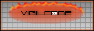
its simple and cute (didnt mean to say that)

Post by: mrRobinson on July 23, 2007, 06:00:00 PM
Hopefully this saying I just think I made up is true.
Keep in mind too that I honestly would use any of these as they are great but I'll try to use these as pro/con examples and maybe something more fitting will be produced.
For the first one that cowbell did, great, clean, with animation has a wow factor or coolness to it. But I'm thinking more of computer networks reliability and security and this makes me think of Grand Theft Auto so maybe would be great for a car security logo. I'd take this and try to make it more corporate classy less uhm whatever the opposite of that is. Maybe if bullet holes were replaced with a circuit board stamp kind of embossed on it.
Second one cowbell did, again impressive but too like a badge. In other words I'd have to be carefull what kind of background I put it on as with the cut off ropes or strings it could look weird or like it was missing the rest of it. Also don't like the rope or whatever running through the text cause it take a second now to process the work VigilCode and I need clear readability at a glance. This logo can be web page with animation but I'd also like to apply it to letterhead and a business card one day so it has to flexible and generally simple. I do like the crosshatch in the lettering of this one. Unique, classy, simple.
the one by Lil wilson, I agree simple and cute, which I like. I also like the grid lines as i see them on engineering technical papers and makes me think of precision which is good. I think the text is too small within the area though. I need this to be more text design with a subtle background that won't take away from the foreground.
Overall, great. If no more tries were made I'd be 100% better off than where I was. If more tries are coming then hopefully these responses hope me get closer to the unobtainable perfect logo that I'm sort of picturing but can't.

have fun with it!
Post by: saunders73 on July 23, 2007, 07:26:00 PM

Post by: mrRobinson on July 23, 2007, 09:15:00 PM
This is probably the hardest way to create something for someone as I've given guidelines but nothing concrete. It's like you have creative freedom, but in a cage.
Great job so far, keep 'em coming!

Post by: pitbullz on July 24, 2007, 10:07:00 AM

Post by: SC10-E on July 24, 2007, 12:43:00 PM
QUOTE(I Want More CowBell @ Jul 24 2007, 02:35 PM) 

Pitbullz, I like yours alot.
How bout it, mrRobinson?
Post by: LiL WiLsoN on July 24, 2007, 12:49:00 PM
Post by: I Want More CowBell on July 24, 2007, 01:01:00 PM
QUOTE(SC10-E @ Jul 24 2007, 02:19 PM)
Pitbullz, I like yours alot.
How bout it, mrRobinson?
you like pitbullz but you quoted mine, lol
thanks murda for that compliment :beers:
Post by: SC10-E on July 24, 2007, 01:04:00 PM
QUOTE(I Want More CowBell @ Jul 24 2007, 03:37 PM)
you like pitbullz but you quoted mine, lol
thanks murda for that compliment :beers:
whoops! sorry lol.
I like yours alot too Cowbell
Post by: LiL WiLsoN on July 24, 2007, 01:05:00 PM
and u make ur own skateboard decks? (offtopic)
Post by: mrRobinson on July 24, 2007, 02:33:00 PM
pitbullz was the first one I think that gave it the computer tech feel I was looking for. I also love that dark type red color. Metallic text very nice.
Same deal with cowbell's third one. computer tech is there again but don't think text on the angle like that suits me.
I'm wondering if you guys can make one without it being defined so clearly by a rectangle.
Like see the xbox-scene logo above. Obviously its a square image but you can't tell.
Could someone maybe do the vigilcode letters out of what looks like a circuit board and then vertically behind that have streaming 0's and 1's like matrix style that fade to translucent at the edges so that nothing is really defined by a square. Then if the background was transparent I could put it on black or white background web page and it should still look great. I also don't want to give up on the potential for the O to be an eye. if the letters are circuit board then maybe an red glowing eye like how it would look if it was an LED.
sorry about all the details but I do enjoy looking at all these so the more that come in the better.
Post by: SC10-E on July 24, 2007, 02:42:00 PM
Post by: mrRobinson on July 24, 2007, 04:31:00 PM
Can you add liquid metal streaming 0's and 1's behind the text and can the text be made out of that dark red circuit board like what was in pitbullz? then with the eye like that or red it'd be perfect.
Post by: saunders73 on July 24, 2007, 04:53:00 PM

Post by: mrRobinson on July 24, 2007, 07:05:00 PM
can you try adding some sort of circuit board pattern to the letters?
also can you try making the 0's and 1's look like they are coming up and down like in this image?
http://homepage3.nif...atrixScreen.JPG
Keep the fade you have going in the zero's and one's that is perfect. transparent background, perfect. The eye, perfect. Might want a version without the eye.
Post by: pitbullz on July 25, 2007, 06:53:00 AM
Post by: mrRobinson on July 25, 2007, 09:01:00 AM
1. can it be one word? (no space in between vigil and code)
2. on the ones with the transparent background can you get rid of the red fuzziness behind the 0's and 1's as that makes my eyes draw the box around the image. Just do it like you did it when you had the zero's and one's horizontal and they faded a bit at the edges. that looked cool. On the black background that red fuzziness is needed as it gives it depth.
3. Can you make these changes and still provide me with one version with the metal text and another with the circuit board text as I like them both.
Thanks!
And cowbell is being great trying to make magic out of my sometimes rather vague details but in the end I'm saving all of these and it'll be coming to a vote with about 10 people so if you have a brainstorm of something creative you think you can do with "VigilCode" that sort of conveyes computer network security and monitoring etc then please have at it as many of you are quite talented.
Thanks everyone this is turning out better than I had hoped.
Post by: mrRobinson on July 25, 2007, 11:28:00 AM
can the O in code be just like the rest of the font use and then just put the eye inside the O. Instead of making the entire eye the O as it is now?
Post by: mrRobinson on July 27, 2007, 11:20:00 AM
Post by: mrRobinson on July 30, 2007, 09:10:00 PM
Post by: mrRobinson on August 08, 2007, 07:54:00 AM
QUOTE(mrRobinson @ Jul 25 2007, 11:37 AM)
wow. almost done. I'd like to request a couple minor tweaks.
1. can it be one word? (no space in between vigil and code)
2. on the ones with the transparent background can you get rid of the red fuzziness behind the 0's and 1's as that makes my eyes draw the box around the image. Just do it like you did it when you had the zero's and one's horizontal and they faded a bit at the edges. that looked cool. On the black background that red fuzziness is needed as it gives it depth.
3. Can you make these changes and still provide me with one version with the metal text and another with the circuit board text as I like them both.
Thanks!
can anyone tackle these final changes? Or if someone has another creative spark go right ahead.
Post by: rob1231 on August 23, 2007, 02:28:00 PM
QUOTE(I Want More CowBell @ Jul 25 2007, 08:22 AM)

amazing....nuff said. easy choice i think. make it one word, and i would easily select this one, great work CB..great.